Bible margin links: when the links show

Eric

Beta Tester
Messages
885
It may be I'm missing something, and that what I'm looking for is already there, but … since I can't find it, I'll post this and see what kind of response I get.

I did not use the margin links previously, but now for some time I have been using them, and I find them very useful. Am I right that this is how they work: (1) if the link is to any module in the "Books and Dictionaries" pane, then, the margin link next to a verse only shows up if there is a link to that specific verse, i.e., if there is content in that book/dictionary specifically referenced to that verse. Wonderful! (2) However, if the link is to a any module in the "Commentaries" pane, then the link will show up next to every verse, even if the commentary is blank for that verse. I would propose that this is not ideal. As it is now, I click on the link, and there's nothing there in that commentary, and I've wasted time looking for non-existing content. In most cases, what I would like is that the margin link to commentaries only show up if there actually is an entry for that verse in the commentary linked to the Bible margin. For some user commentaries (but surely not all), I would like the option to have the link always show up.

So what I'm asking for as a new feature would make the default for all commentary links such that they show in the margin links only if they have content for that verse. I think, however, there should be a setting (as illustrated in attached screenshot) for forcing commentary links to show even if there is no comment. This is particularly useful if you are putting your own devotional comments into a user commentary, and you want to just be able to always quickly go to that user commentary and add a comment.

1. Am I correct that what I would like is not currently available? (I often miss features, so I'm afraid to ask for new ones, being unsure if they are already there!)

2. Brandon, what do you think about this? Have I made a good case for it? Would it be so much work to program that it's not likely to happen?

3. Others, would this proposed feature help you in your Bible study?

Thanks, everyone!
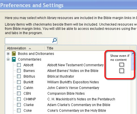
Proposed feature %22Show margin link even if no content%22.png
 
I don't think I am reading this right. There should not be a link in the margin to an empty commentary. (There are links to commentary entries that themselves are links to another entry, but I digress).

However if you have a USER module that is editable, and you have that module enabled for margin links, the edit link will show on every verse, so that you can instantly start writing notes on that verse.

But empty commentary entries do not get links in the margin area.
 
That's the problem. I was probably only noticing it with USER commentaries. I want some user commentaries to always be in the margin regardless. But I have other user commentaries that I want to alert me (show link in margin) only when there is an entry for that verse. They are more static user commentaries that are sometimes nothing more than scripture indices for paper books – I only want to see the link when there's something in there (but I do want them editable – I'm always finding typos or errors to fix in them). Does that make sense? I.e., I don't want all user (editable) commentaries to automatically show their links, as they do now. I'd like to pick and choose. Probably asking too much, huh? I hope not.
 
And my screenshot was not good – it showed non-editable commentaries, which, as you said, only show up in the margin if they have content (they should not have the option I was proposing). Part of the problem is that I can get an unwieldy number of links in the margin.
 
Someone may have created a user commentary with empty comments so that every verse would have a comment. You could export that commentary and delete all the empty entries. Then run it through Forge. In the example below you would want to delete the 2nd and 3rd entries. You might be able to get all the empty ones with a global change command in a text editor.
$$ ge 1:1 In the beginning ...
$$ ge 1:2
$$ ge 1:3
$$ ge 1:4 some comment...

You could make the commentary non-editable as an option when recompiling it with forge. I have done this with all user commentaries except my own notes which I want to edit on every verse.

You could also set up a widget to edit a particular user commentary and then hide all user commentaries from the margin. You could still have all user commentaries displayed in the tabs of the commentary window.
upload_2014-11-21_9-47-1.png
 
You could also set up a widget to edit a particular user commentary and then hide all user commentaries from the margin. You could still have all user commentaries displayed in the tabs of the commentary window.
View attachment 489
This is how mine is set up, and it works very well. You can rest the cursor over the widget to see the preview, just like other links. The widgets are lighter colored if there is no content. If the Commentary is editable and has content, you can use Shift+Click to open it in the editor.
 
Eric, I think I understand now. I would also recommend the verse widget option. Three widgets may not be enough for what you want to do, but right now the level of detail you want to control isn't possible.
 
Brandon, Bill & Marty (in order of responses),

Well, I've checked out the "Favorite commentaries" widget approach to see exactly what it will give me, and I don't think it'll help me. The problem is that unless a given verse has been clicked on in the main window, the commentary window won't show which tabs have content for that verse. That is the genius of the way the margin links work (for non-editable books and for commentaries). One can scan the chapter (or watch as Scourby reads it) and immediately see which margin links show up.

With the Favorite commentaries widget functionality as it is now, it seems to me that it would be much better if the default for whether margin links show up for editable modules should be the same as for non-editable modules. As it is now, you have two ways to quickly get to an editable module from the main Bible window (assign a widget or use the margin links), but you have no way to quickly see from the main Bible window which editable modules have content. If the default were changed (or if my original suggestion were implemented), you'd have both – a quick way to get to an editable module and an easy way to see if you have content in any editable module that's in the margin links.

As a workaround, I also had thought of making a user module non-editable (as Bill suggested), but that would be a clunky way to to do it and would fill up the commentaries panel. For each editable commentary module that I want to be (1) editable and (2) only visible in the margin links when it has content, I'd need to make two modules (with slightly different names), one of which would be editable and one of which would not. And I'd need to often run the editable one through Forge to become the uneditable one in order to keep the margin links data up to date. Can you see my dilemma?

It seems to me that changing the default viewing of editable modules would not be a big job, and SwordSearcher would not lose any capabilities. Is that so, or am I missing something?

Thanks for your patience with me!
 
it seems to me that it would be much better if the default for whether margin links show up for editable modules should be the same as for non-editable modules.

It is the same, so I think I have misunderstood you.

Take a look again at the favorite commentary widget. It changes color if there is content on the linked commentary (it is less intense if the entry is empty), and also gives you a quick way to edit an editable commentary whether or not there is an entry. If you can't see the color distinction then there may be an issue with how the color intensity is being calculated on the colors you are using.

The way margin links for editable modules show is the same for user and non-user modules. The only difference is that there is an additional option to show an "edit" link for editable modules which is either on or off for the whole margin area and for all editable modules included in the margin by your settings.

Are you saying you want to explicitly control whether or not an editable module is included in the block of editable module links, separately from whether or not it is linked in the margin where there is content?
 
Last edited:
2014-11-22_7-03-32.png
 
It seems to me that changing the default viewing of editable modules would not be a big job, and SwordSearcher would not lose any capabilities. Is that so, or am I missing something?

I can answer this in a general sense. Requested features may be easy or complex jobs, but I am typically more concerned with the impact on the user experience. Given the high number of features included in SwordSearcher I am always trying to make sure the UI doesn't become inscrutable. If I am having a hard time understanding the need for a particular option request it is going to be next to impossible to implement it in such a way that doesn't confuse everyone except the one who requested it. :)

Thanks for your patience with me!

No problem. I think I may have simply misunderstood your goals. Once I am sure I understand what you are trying to accomplish I can more easily decide if your feature suggestions are ones I will implement.
 
The way margin links for editable modules show is the same for user and non-user modules. The only difference is that there is an additional option to show an "edit" link for editable modules which is either on or off for the whole margin area and for all editable modules included in the margin by your settings.

Thanks for explaining it for me. I see more of what you're getting at – I might just get it figured out yet! However, where is this setting referred to above that sets the edit link on or off for all editable modules? Maybe I missed that.
 
I can see a use for being able to control the display of editable commentary links to reduce margin clutter.

I would like to show just mynotes with an edit link and hide any others. Maybe if the toggle for "show edit links (for user commentaries)" had a dropdown with check boxes, that would solve the clunky way I mentioned of exporting and then reimporting user commentaries (as non-editable).
 
Thanks for explaining it for me. I see more of what you're getting at – I might just get it figured out yet! However, where is this setting referred to above that sets the edit link on or off for all editable modules? Maybe I missed that.

2014-11-23_7-57-21.png
 
I can see a use for being able to control the display of editable commentary links to reduce margin clutter.

I would like to show just mynotes with an edit link and hide any others. Maybe if the toggle for "show edit links (for user commentaries)" had a dropdown with check boxes, that would solve the clunky way I mentioned of exporting and then reimporting user commentaries (as non-editable).

Thanks for the input. I can also see value here because of the number of editable commentaries that people can download -- and would not want to edit. At the least I could add a pop-up menu option on the commentary tab to exclude it from the editable margin links in the margin... I will have to think about it and this is on the feature request list now.
 
I think I've succeeding in not really noticing this button and never using it. It may be that just by using it I'll get all the functionality I need. I can use a widget for the one or two user commentaries I might want to regularly edit, and I can toggle off the edit links for user-editable commentaries. Then the margin is not so cluttered. I'll try it for a while and see what I think. Thanks for showing it to me – right in front of my face, but unnoticed. Like many of the mercies of God!
 
Back
Top