I have been going through all the settings in the eval version of SwordSearcher, and I've been able to adjust just about everything pretty well for use on a TV screen 7 feet away (yes, that's actually how I use my PC  ). However, there are a few size adjustments that could be added.
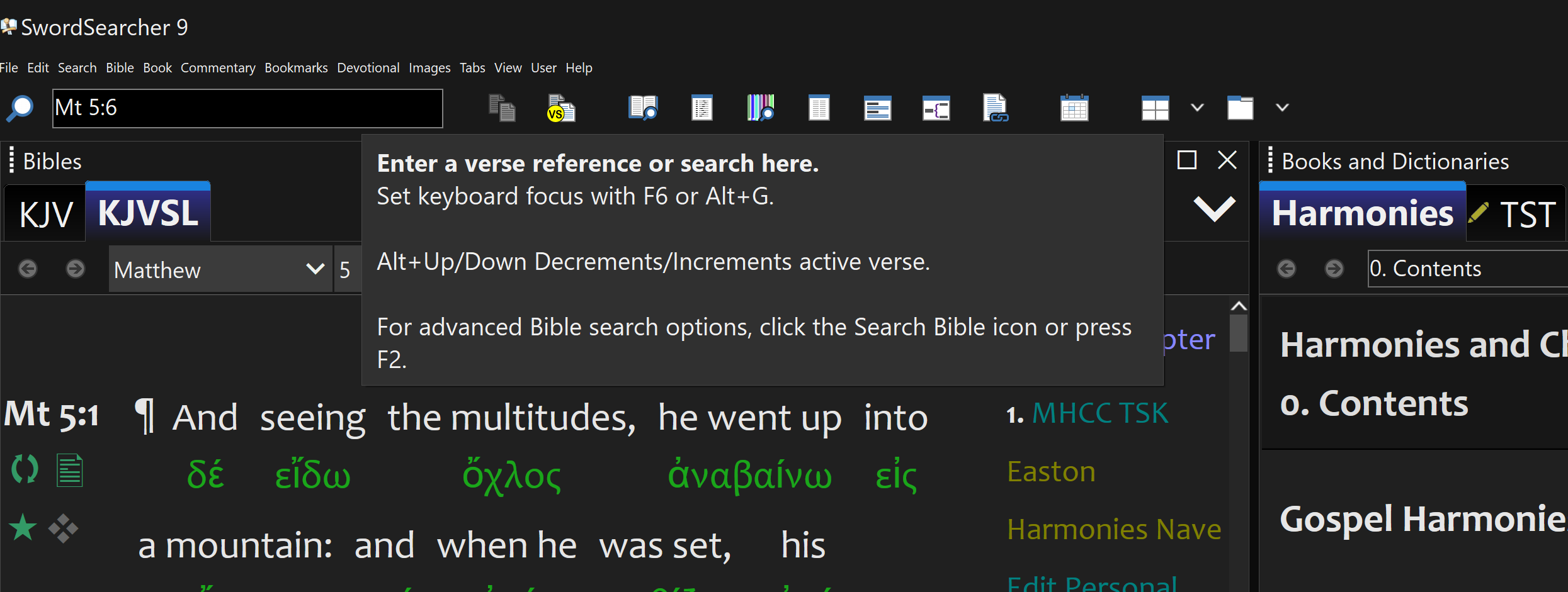
In the new dark mode, the menu bar is very small and not easily readable. (Note -- the submenus aren't so small and are readable). I realize dark mode is new so this is probably just a tweak:

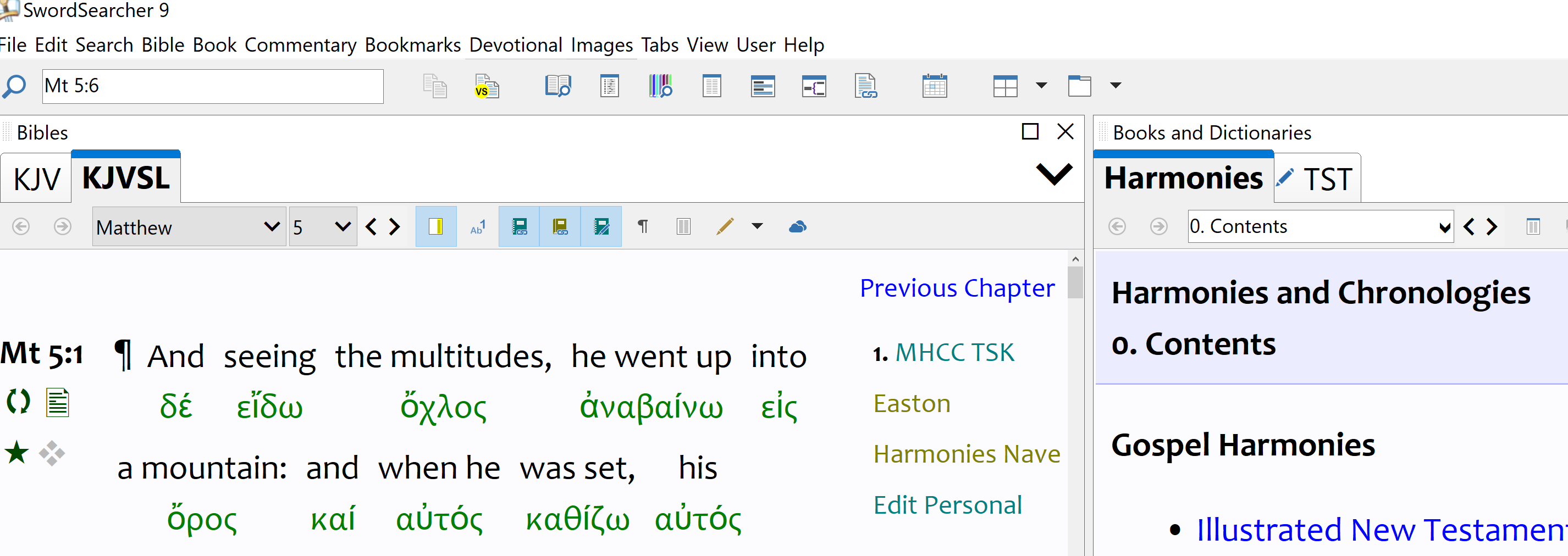
Whereas in light mode:

Along the same line, it would be nice if the button icons under the menu and in the modules could be enlarged a bit as they are harder to see in dark mode, even though they are the same size in both modes.
Also, I like that I can create a 2-column layout and stack the Bible and Search (and related) modules on the left, and the Books/Dictionaries and Commentaries modules on the right. When doing this, tabs are created along the bottom for the modules. It would be great if these tabs could be enlarged along with the other library tabs, as they are pretty small:

Library tabs resized:

I used to like everything about as small as possible so that I could fit more on one screen. Now I'm the opposite -- I need it all enlarged! Ha. Yeah, large and clunky.
Anyway, it might not be as common to stack the modules this way, but enlarging those module tabs along the bottom would be helpful as well. They aren't terribly small like the menu at the top, but would just be better to be able to size them as with the library ones.
The last thing to maybe resize (and this might not be possible), is that it would be nice if the Strongs text could be made a little smaller than the Bible text. When adjusting the Bible text, they both adjust together and the Hebrew words (for example) are a big large. I assume these are closely tied together so this might not be possible.
Having said this, I'm surprised by just how many nooks and crannies of the layout can be easily customized and resized. The fact the library tabs and the pop up fonts can be resized is great, and that each module can be customized independently is helpful.
Hope you don't mind a few suggestions from an evaluator -- but since I'm going through the application customizations I thought these might be somewhat helpful.
Thanks!
In the new dark mode, the menu bar is very small and not easily readable. (Note -- the submenus aren't so small and are readable). I realize dark mode is new so this is probably just a tweak:
Whereas in light mode:
Along the same line, it would be nice if the button icons under the menu and in the modules could be enlarged a bit as they are harder to see in dark mode, even though they are the same size in both modes.
Also, I like that I can create a 2-column layout and stack the Bible and Search (and related) modules on the left, and the Books/Dictionaries and Commentaries modules on the right. When doing this, tabs are created along the bottom for the modules. It would be great if these tabs could be enlarged along with the other library tabs, as they are pretty small:
Library tabs resized:
I used to like everything about as small as possible so that I could fit more on one screen. Now I'm the opposite -- I need it all enlarged! Ha. Yeah, large and clunky.
Anyway, it might not be as common to stack the modules this way, but enlarging those module tabs along the bottom would be helpful as well. They aren't terribly small like the menu at the top, but would just be better to be able to size them as with the library ones.
The last thing to maybe resize (and this might not be possible), is that it would be nice if the Strongs text could be made a little smaller than the Bible text. When adjusting the Bible text, they both adjust together and the Hebrew words (for example) are a big large. I assume these are closely tied together so this might not be possible.
Having said this, I'm surprised by just how many nooks and crannies of the layout can be easily customized and resized. The fact the library tabs and the pop up fonts can be resized is great, and that each module can be customized independently is helpful.
Hope you don't mind a few suggestions from an evaluator -- but since I'm going through the application customizations I thought these might be somewhat helpful.
Thanks!