Although I had previously started to use the Reading Schedule in SwordSearcher, I never stuck with that electronic (computer) method of documenting my Bible reading. I don't recall now why, but maybe it was because of what I found inconvenient with the Reading Schedule panel.
Right now I'm over a month and half into reading / listening through the Bible in 88 days. I find that the Reading Schedule panel gets in my way all the time. I have to slide it back and forth across my screen to get it out of the way of whatever I'm doing. I take notes regularly as I read / listen to the Bible (on a laptop). I don't have enough screen real estate to have a dedicated place for that panel. So it's floating over the two other panels (Books and Dictionaries and Commentaries) or ends up over the section at the right of my screen that I've reserved for editing user modules.
(My custom layout is Bible at top left with Search Results under it, then to the right I have the Books and Dictionaries panel above the Commentaries panel. There is an empty vertical space to the right of all that which is where I edit user modules.
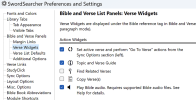
I think it'd be great to have another Widget or something like it alongside the Bible panel so I could click to see the Reading Schedule, but when I click elsewhere it would just disappear. I also would like it if the Reading Schedule would always appears in either full length for all chapters for that day, or, better yet, if I could set the default size of it to the largest I think my reading plan will require and it would come up at that size. Since I'm reading about 45-50 minutes / day, the list can be long when there are lots of chapters, and I find myself wasting time expanding the panel.
I hope I've explained this understandably. I'm sure there are better ways to accomplish what would help me use the Bible Reading Plan functions better, but that's how I'm thinking today.

