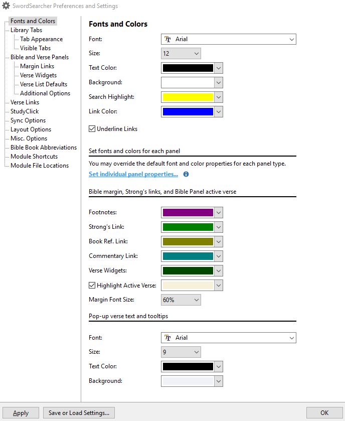
I'm wondering what fonts others use in SwordSearcher. If anyone would like to chime in and perhaps also attach screenshots, that would be helpful. See File > Preferences and Settings > Fonts and Colors to find out what you're using.

Seems that maybe way back Tahoma was a default, perhaps now Calibri is. For whatever reason (I don't know if I chose it or if it defaulted to this), my current default is Arial. I definitely want a sans serif font, but I'm finding that the letter spacing sometimes is uneven.
Font size for below samples is 12 pt.
Here's Arial (notice how some letters "scrunch" upon too close to others):

Here's Tahoma (same issue):

Here's Calibri (this font seems to take up too much space horizontally, i.e., the font face seems small to me compared to the other two, and the distance taken up by the whitespace between words seems excessive; Calibri is not as dark either, so it's harder for me to see; the leading (distance between lines of text) also seems to be more with Calibri, so it takes up more screen real estate):

Seems that maybe way back Tahoma was a default, perhaps now Calibri is. For whatever reason (I don't know if I chose it or if it defaulted to this), my current default is Arial. I definitely want a sans serif font, but I'm finding that the letter spacing sometimes is uneven.
Font size for below samples is 12 pt.
Here's Arial (notice how some letters "scrunch" upon too close to others):
Here's Tahoma (same issue):
Here's Calibri (this font seems to take up too much space horizontally, i.e., the font face seems small to me compared to the other two, and the distance taken up by the whitespace between words seems excessive; Calibri is not as dark either, so it's harder for me to see; the leading (distance between lines of text) also seems to be more with Calibri, so it takes up more screen real estate):